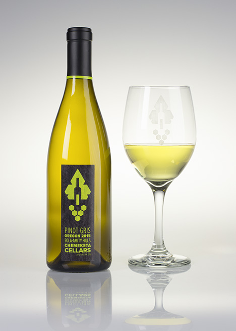
Chemeketa Cellars
May 2014
- Icon Design
- Layout
- Color
- Type Setting
- Client
- Northwest Viticulture Center
- Class
- ART223 Package Design
- Instructor
- Christine Linder
Task
Northwest Viticulture Center was changing their name to Chemeketa Cellars. As a result they needed a new look. My class was assigned the job of designing a new label with the possibility of a new logo. It needed to stand out, while being stylish and sophisticated.
Solution
I started with an icon that represents what Chemeketa Cellars is. My solution was to create an abstracted icon with traditional wine making imagery. The leaf, grapes, and bottle are created out of hexagons and pure shapes. This forms a visually powerful icon. The type setting forms a texture within another geometric shape. This adds interest to the bottom of the label. The texture ties it all in and creates a naturalistic feel.